BE BOLD
BE SEEN
BE FRESH

Not just a pretty design, but the soul of your business.

In today's technological era, with hundreds of thousands of businesses competing against eachother, it's extremely hard to stand out of the crowd with only offering quality products or services. Your business needs a strong visual identity which makes people stop scrolling and look twice.

But in a sea of copy-paste templates and fleeting trends, is it enough to just find a pretty design on a platform and slap it onto your business?

No.

Your visual identity needs to tell a story, to catch the true values of your product, to make the world stop and ponder.

And that's where I come into the mix.
Hello, all! I'm Adnana and I'm a Graphic Designer & Illustrator, specializing in brand identity, logo design, and 2D Illustrations.

I've always been a creative person, I've been drawing, scribbling, painting since kindergarden. Creating something from scratch on my own made me the happiest! So one day I thought: "If I like it so much and I'm good at it, why not do this to earn a living?"

For over 5 years I've been creating funky and bold designs which bring joy, color, and a breath of fresh air to this grey and dull corporate world we live in.

If you're also tired of the same boring, soulless minimalist approach and want to dive into an original visual identity that really showcases the true values of your business, then what are you waiting for?

Let's work together!
Contact me!

BROWSE THROUGH PROJECTS

Nanarty
Personal Brand Identity
and Brandbook
Lunar
Visual Identity for a
witchy-inspired Cafeteria
Greatland
Graphics and Illlustrations for a
Strategy Board Game
Tizo
Package Design for an
Iced Tea Beverage
School Maps
Illustrated Maps for
a Middle School
Alternative School
Logo Concept for
Alternative School's
18 Years Anniversary
X

NANARTY

PROJECT TYPE
Brand Identity & Strategy, Brandbook
In a world of dull grays, corporate minimalism, and rigid designs, I aimed to bring back the funkiness and boldness of retro times, but with a modern twist. Thus the Nanarty brand was born!
I've never considered myself as a serious person, I see myself as a "grown up child". I still like playing, dreaming, being silly, and I wanted to reflect that into my personal brand. But despite the youthful color choice and cat lover symbolism, I still wanted to convey trust and professionalism to my current and future clients.

Being childish and dreamy doesn't necessary mean disorganised and chaotic. It means that I care about originality, creativity, and aiming to spark the love of life into everyone's hearts. This is exactly what my brand stands for!
X

LUNAR

PROJECT TYPE
Brand Visual Identity
This is the visual identity for a witchy-inspired cafeteria. The earthly tones, silly characters and funky fonts give the brand a cozy and friendly vibe.
Usually, witch-themed places have a really dark vibe, making the space feel spooky and intimidating. I wanted to take a different approach to this project, since the goal of this cafeteria is to bring in more clients of various backgrounds, make it more appealing to people outside the dark/gothic scene.

I chose the theme of the green witch, a person who is closely in link with nature, respects animals, and wants to bring joy, warmth, and spirituality to the world around them. I carefully designed every aspect of the visual identity to encapsulate the vision of the green witch.
X

GREATLAND

PROJECT TYPE
Board Game Design & Illustration
This board game was my final thesis for my Masters in Graphic Design. I've been working on it for 4 years, sketching, testing, redoing and rethinking, until I could get to the point to say that it's finally done and ready to print.
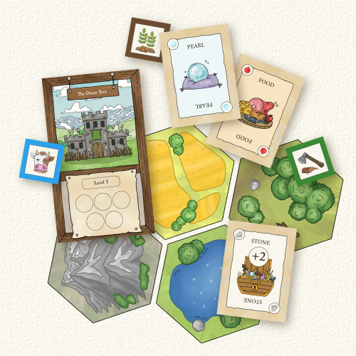
Greatland is a strategy board game inspired by the well-known board game Catan and the video game series Civilizations.

The main plot of the game is becoming the king over the great land of Greatland! You start as one of the four chieftains, each experienced in a certain skill, and you try to expand your tribe to the point when you have enough resources to forge the Legendary Crown, or a huge army to defeat the rival tribes.
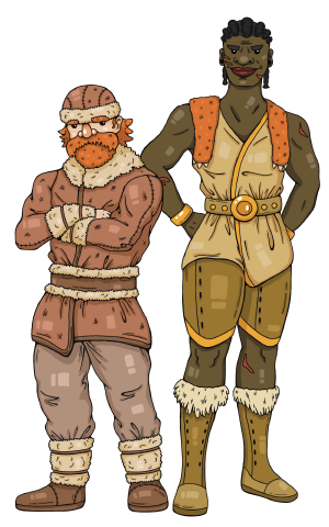
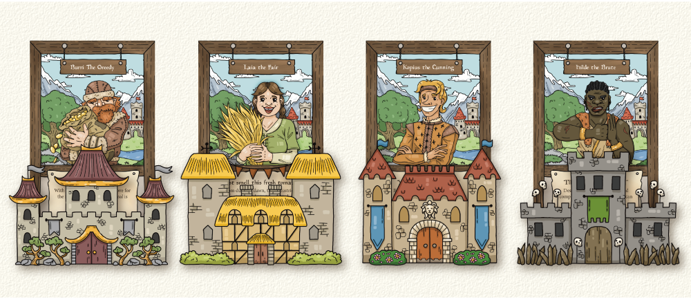
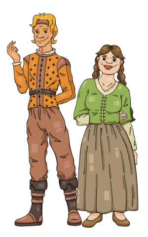
The game can be played between 2 and 4 players, each player ruilng with a unique chieftain. Burri is always looking to make more gold, Laia can work the fields twice as good than any other chieftain, Kopius' sharp tongue strikes the best deals, and Hilde's iron fist crushes all of her enemies.

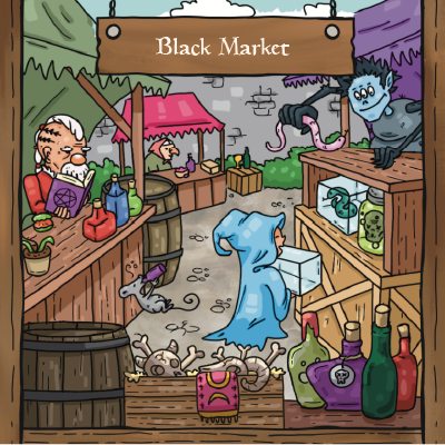
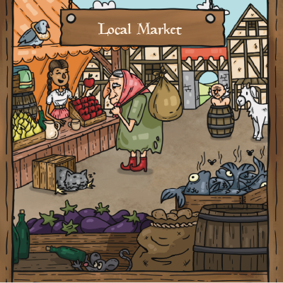
During the game, players can do all kinds of things to get closer to winning, such as expanding their tribe to gain multiple resources and gold coins, reinforce their army, build fortifications, trade with each other through merchants, buy or sell resource cards for gold at the markets, go to war with other players, convert special resource cards into Rainbow Shards to forge the Legendary Crown.
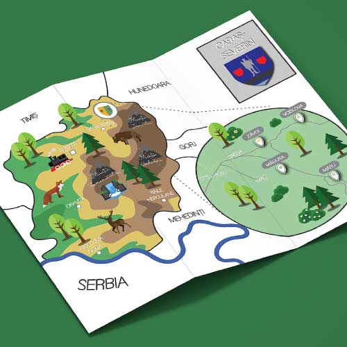
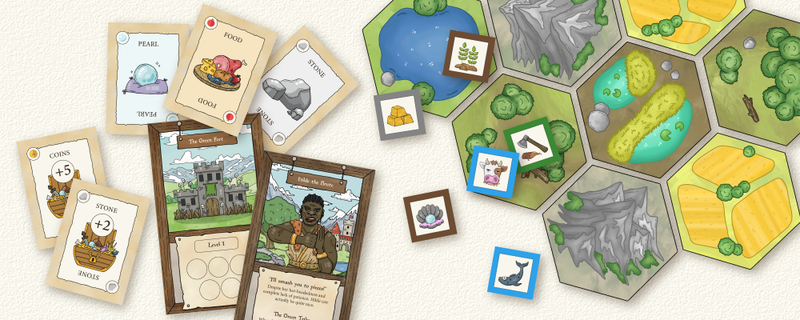
I have carefully designed each element of the game, from the resource cards to the tile hexes that builds the map. The creative process stretched along one full year of sketching, outlining and detailing the graphics.
I have not only created the illustrations, but I have also optimized each element for print, carefully choosing the color settings, fixing bleeds for cards and cutting paths for custom pieces.
Now, the design is finished, the rulebook is written, and I am currently preparing the game to be manufactured. If you'd like to learn more about my board game, follow me on social media for updates regarding Greatland, and more!
X

TIZO

PROJECT TYPE
Package Design
I created an illustration for an iced tea beverage, with green tea and jasmine flavours. I aimed to create an eye-catching illustration which also encapsulates the freshness of the flavours and the smooth taste of the flavours.

Green tea is originary from China, where its strong taste and medicinal benefits have been used for centuries. The sweet flavour of jasmine, a fragrant flower found in most parts of Eurasia, Africa, and Oceania, compliments the bitter taste of the green tea.

To showcase the combination of the two flavours, the illustration depicts a young Chinese woman (delicate like jasmine) wearing a tiger headdress (strong like green tea), surrounded by an array of leaves and jasmine flowers (the combination of the two flavours). The boldness of the background compliments the soft greens and yellows, bringing a fresh and exotic vibe to the whole design.
X

SCHOOL MAPS

PROJECT TYPE
Vector Illustration
I was asked to design a set of illustrated maps by the principal of Zăvoi commune’s elementary school. These maps display the locations of schools overseen by Zăvoi commune in Caraș-Severin, Romania.

Serving both decorative and informational purposes, the maps are designed with simplicity to be easily followed and understood, yet vibrant enough to attract both the students and teachers’ attention.
X

ALTERNATIVE
SCHOOL

PROJECT TYPE
Logo Design
This was my entry which got me into the finals of Alternative School's Logo Competition, the task being to create a logo for the school’s 18 years anniversary.
After a bit of brainstorming and sketching, I got the idea of creating the face of a student using the numbers 1 and 8, and the school’s initials (A and S).

The two chosen colors (sunny yellow and sky blue), inspire creativity, innovation, and boost learning, the 3 key values which the school is promoting.

I also designed an alternative logo which can be used outside the 18 years anniversary theme, still respecting the style of the first logo.
© 2025 Nanarty Creative All Rights Reserved
FOLLOW ME
ON SOCIAL MEDIA
AND TOFU GETS
A TREAT!